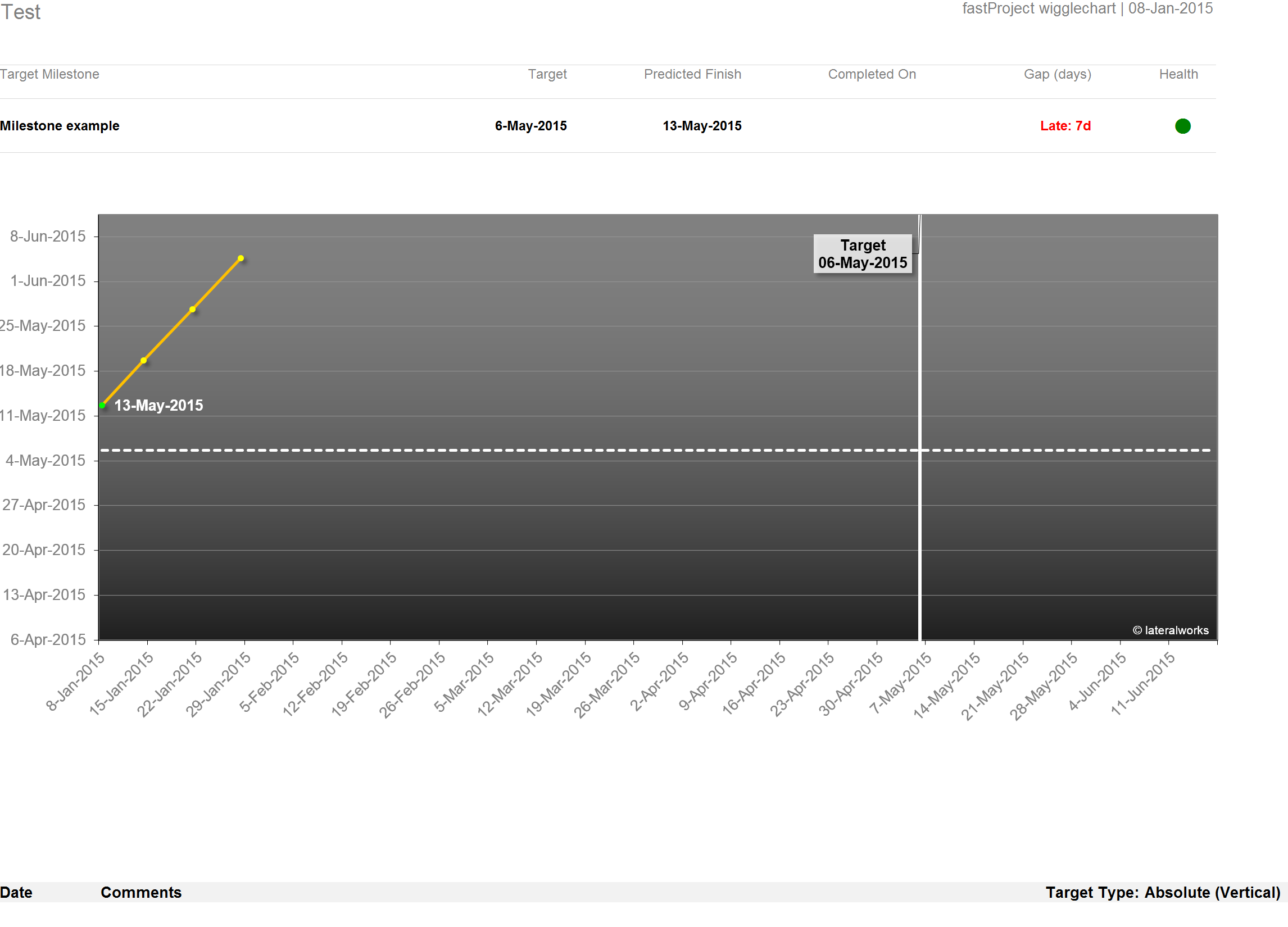
The first example above illustrates the y-axis in the vertical position (Absolute). The second shows the diagional or "relative" variation. The y-axis can be changed using the drop down menu on "Target Type." Once toggled and saved, it will change the chart when the Wigglechart is re-run. Use the one that makes the most sence to you.
The diagonal variation gives a graphic early warning of a one-for-one weekly slip.
Mathematically, the diagonal line is the x=y line, gradient = 1, i.e., 1 week on the x-axis = 1 week on the y-axis. Thus, if the line is paralleling the diagonal line, it means the project is slipping week for a week, i.e., 1 week later in the refresh, the project slips by a week. If the gradient is >1 then the project is slipping more than a week for each week, and <1 it means slipping <1 week for each week. A negative gradient means the schedule is pulling-in.
The key is being able to see the trend relative to a week-by-week reference (the diagonal line).
It can sometimes look a bit odd because the x-axis has a different scale to the y-axis, so the diagonal line may not be at a 45 degree angle, which is sort of the point - regardless of the scale on the x and y axis, the x=y line is always constant so you can see the trend relative to it.
The reason we like the diagonal (relative) is because you can spot the problem this example illustrates much faster by observing the slope of the trending line vs the diagonal y-axis. Both examples use the same data, only difference is the changed y-axis. In the "relative" example you can see that the trend is parallel to the y-axis. This means that the milestone will NEVER intersect the x/y point, unless something changes on the project.
Note, your version of the wigglechart may have different formatting than the examples above as we are continually improving the visual interface.