Every portfolio review opens with the same question: will the dates hold? Most portfolio reporting answers a different one: what did the programs say about themselves this month? Status gets collected upward and re-keyed into slides, softened a little at each level, and by the time it reaches the room it is a week old and nobody can say which way it is moving.
We built a weekly roll-up for a semiconductor portfolio that answers the first question, and the part worth copying is what it costs the organization: nothing it was not already doing. Core teams keep their schedules in Microsoft Project with fastProject and refresh them in the sixty-minute weekly cadence. Each refresh writes the forecast finish for the program’s standardized milestones into the project’s wigglechart workbook, one row per week, next to the fixed target. A portfolio wigglechart aggregates the program workbooks. A Claude skill we wrote then reads the portfolio workbook and regenerates the report deck: a what-changed one-pager, a portfolio summary, a ranked schedule-position view, and a page per program with a trend chart for every milestone. Workbook to finished PDF takes minutes, and nobody typed a status.
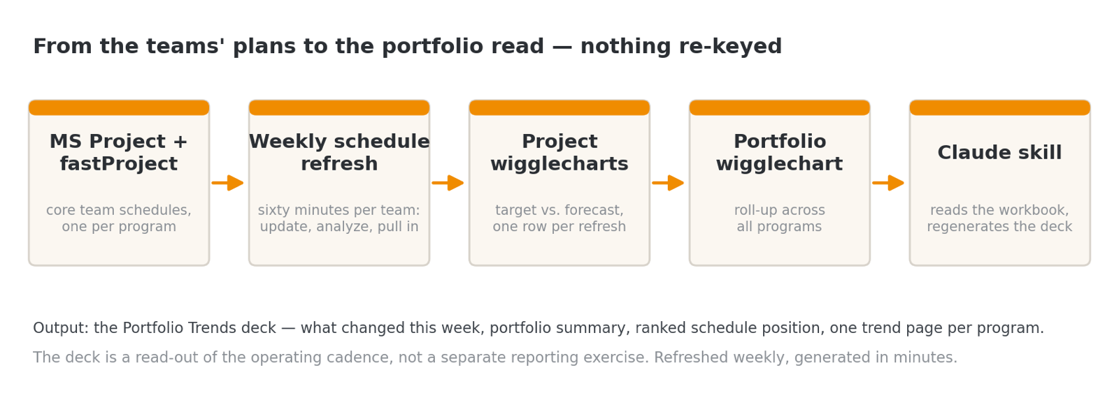
The wigglechart
The instrument underneath is old discipline. The target date stays fixed and the forecast finish gets re-plotted every week; the line the forecasts trace is the wigglechart. Flat means the program is holding. Rising away from the target means the schedule is slipping while you watch. Falling toward it means pull-in actions are working. The gap between the line and the target is the exposure, in days. The slope is the direction of travel. Health bands make the read instant: green within two weeks of target, amber within four, red beyond.
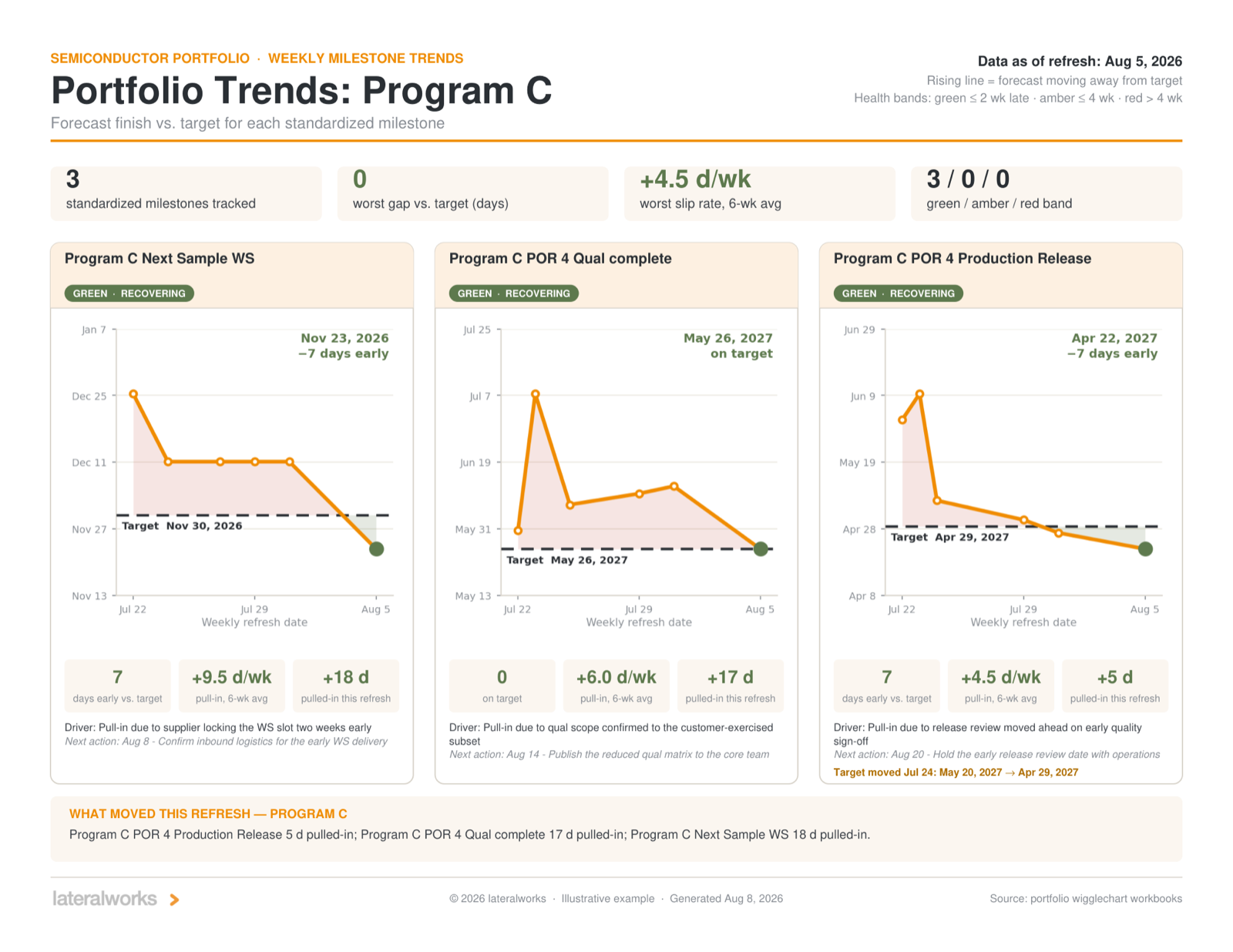
What lands on the executive’s desk
The deck opens with what changed this week: pull-ins and slips measured against last week’s workbook, health-band crossings, worst exposure, and a movement table where every move carries its recorded cause. Behind it sit the portfolio summary, a schedule-position page that ranks every milestone by exposure, and the program pages. Movement is computed from the plans themselves rather than taken from anyone’s status field, so the deck reports what the schedules actually did, not what the programs said about them. Milestones nobody re-forecast get the same honesty: in the example week below, two of twelve still carried the prior update, and the deck says so in red.
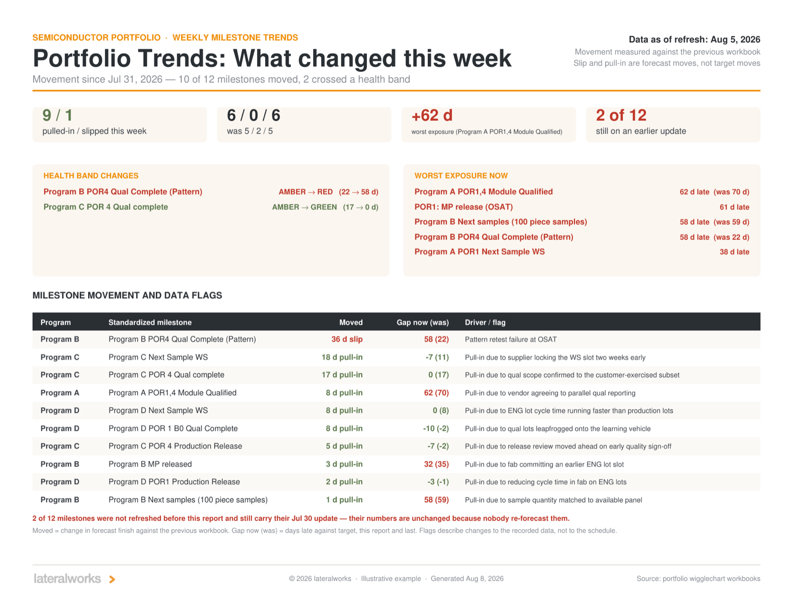
How to read the trends
Four rules cover most of it.
Level and slope are different information. The level is the exposure: how many days late against target. The slope is the management performance: which way the forecast is moving, and how fast. In the attached deck, one milestone sits 58 days late but has been pulling in at better than 20 days a week; another sits 38 days late and is slipping 8 days a week. The second bar is shorter. The second milestone is the bigger problem. Sorting by bar length shows where the exposure sits; the slope shows where to spend the attention.
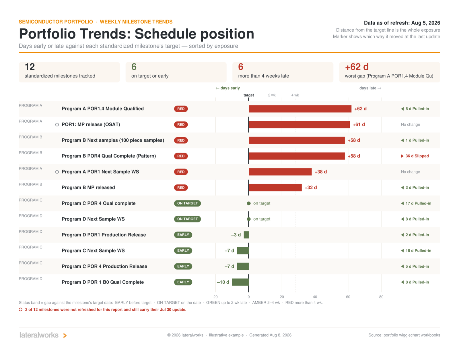
Watch the band crossings. A crossing announces that a threshold changed hands. In the example week one milestone crossed amber to red on a qual retest failure while another crossed amber to green on a scope decision. Same week, opposite directions, both with the cause printed next to the move. That pairing is the normal texture of a working portfolio system: things break and things recover, in public, with reasons.
Separate recovery from target movement. A gap can improve for two reasons: the work sped up, or the target slid. Only one of them is recovery. Target moves are reported in words on the affected card, so a milestone cannot quietly turn green by lowering the bar.
Check whether the number deserves trust. Two tells, both printed on the page: whether every move carries a recorded cause, and how many milestones were actually re-forecast this cycle. A cause-free slip means the workbook knows less than the schedule does. A page of stale tabs produces trend charts with holes that look like stability. The deck reports both instead of hiding them.
The takeaway
For an executive the shift is this: manage the slope, not the snapshot. A date on a status slide is a promise; a six-week trend against a fixed target is evidence. Read weekly, the deck answers three questions in one pass: where the exposure is, which way it is moving, and whether the numbers deserve trust. Over time it buys a fourth thing no status process delivers: honest forecasting. When the trend is public, the targets stay fixed, and every red arrives with its cause, teams stop polishing dates, because a polished date shows up as a cliff in next week’s chart. The forecast tells the truth, the target stays fixed, and the trend between them is the management information.
And the reporting layer is gone. Nobody builds these slides; the deck regenerates from the workbooks the teams already maintain, so the portfolio read is a by-product of the operating cadence rather than a tax on it.
The deck attached below is the illustrative version of a live weekly report: the structure is real, the data is representative, and the client’s identity is withheld.
Related reading: Targets and Trends, The Weekly Schedule Refresh, Aggregate, then Drill Down, The Rhythm of Accountability, and Ten numbers on two clocks.