Every Friday, the core teams on a large development program refresh their Microsoft Project schedules in fastProjectAI: four new product projects running at once, twelve standardized milestones tracked across them. The refresh writes a new row into the wigglechart portfolio workbook, one forecast date per milestone per week. And then a Claude skill reads the workbook and generates the weekly portfolio dashboard: what changed, where to deep-dive, every milestone’s position, and one page per project. Nobody assembles a deck. Nobody colors a cell.
The skill is built once per client, customized to their reporting requirements: their milestone taxonomy, their health bands, their deep-dive rule, their branding. What never changes is the source. The dashboard reads the same schedule files the teams maintain, so the data is as current as the last refresh, every week, without anyone preparing it. A report that is generated from the plan cannot drift from the plan.
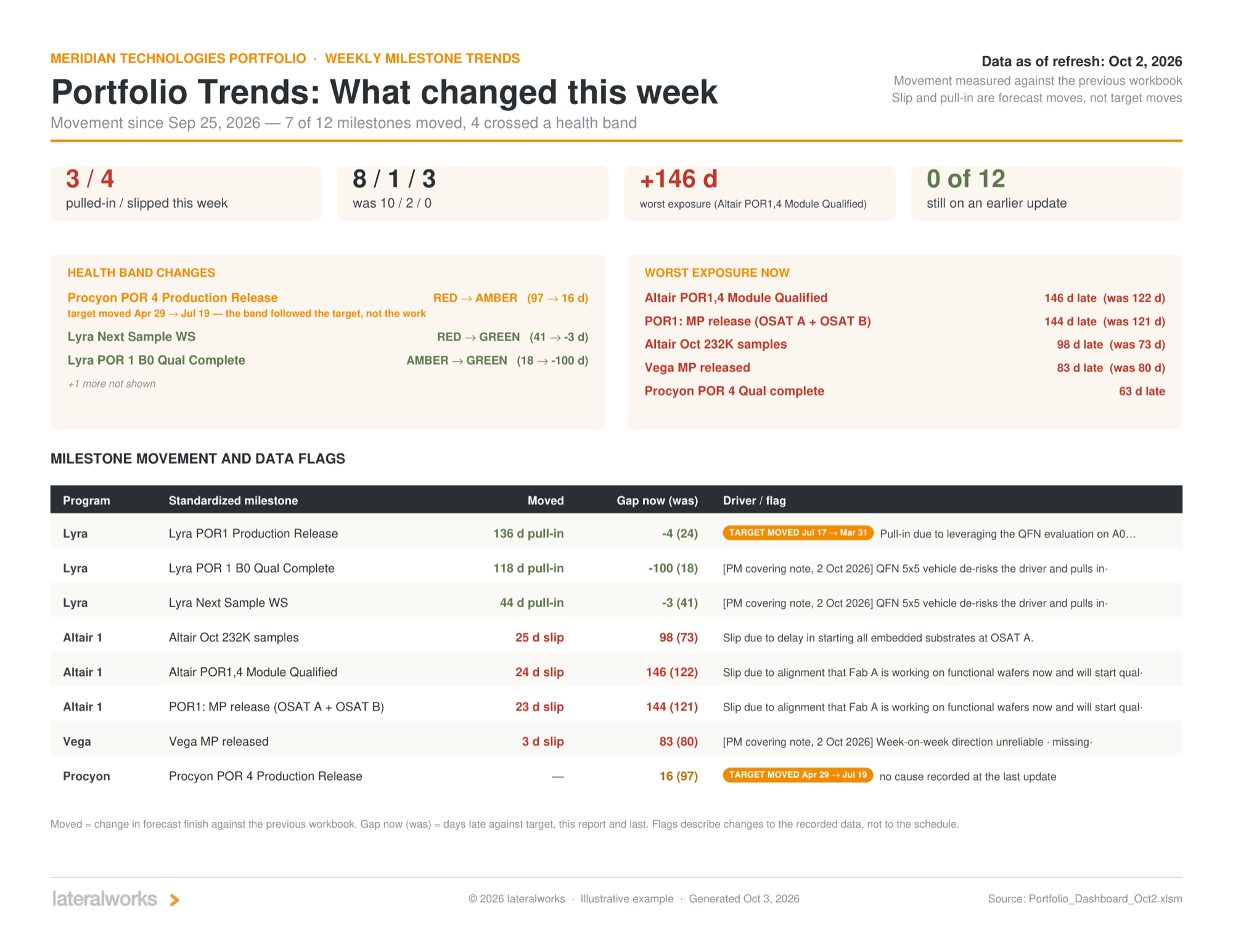
A weekly read in ninety seconds
The what-changed page is the whole week in one screen. At the October 2 refresh, seven of twelve milestones moved and four crossed a health band. Three pulled in and four slipped. The red count fell from ten to eight, and the page immediately tells you how much of that improvement to trust: one milestone went red to amber because its target moved from April 29 to July 19, and the page prints the catch in orange, "the band followed the target, not the work."
The pull-ins are real, though, and the dashboard gives them the same space as the slips. One project pulled three milestones in by 136, 118 and 44 days in a single week by qualifying on a 5x5 evaluation vehicle to de-risk its driver, and the cause of change says so, quoted verbatim from the workbook. A dashboard that only reports problems teaches teams to hide the schedule. One that reports recoveries teaches them to bank schedule in public.
The deep-dive page then applies a written rule, slipped in two or more of the last four refreshes and fourteen days or more lost over them, and four of twelve milestones earn the room. That is the same discipline we published as the exception report: the aggregate on top, the exceptions below, the causes verbatim, the meeting by exception. A single large move with no pattern stays off the shortlist and goes to the monthly project deep-dive, where one schedule gets the hour.
The studies underneath the deck
A weekly dashboard answers what moved. Because the workbook is a time series, 48 refreshes and 210 forecast points over six months, it can also answer questions no single week can. Alongside the deck, Claude runs analysis studies on the same data, and this is where the instrument stops being a status report and starts being a diagnostic.
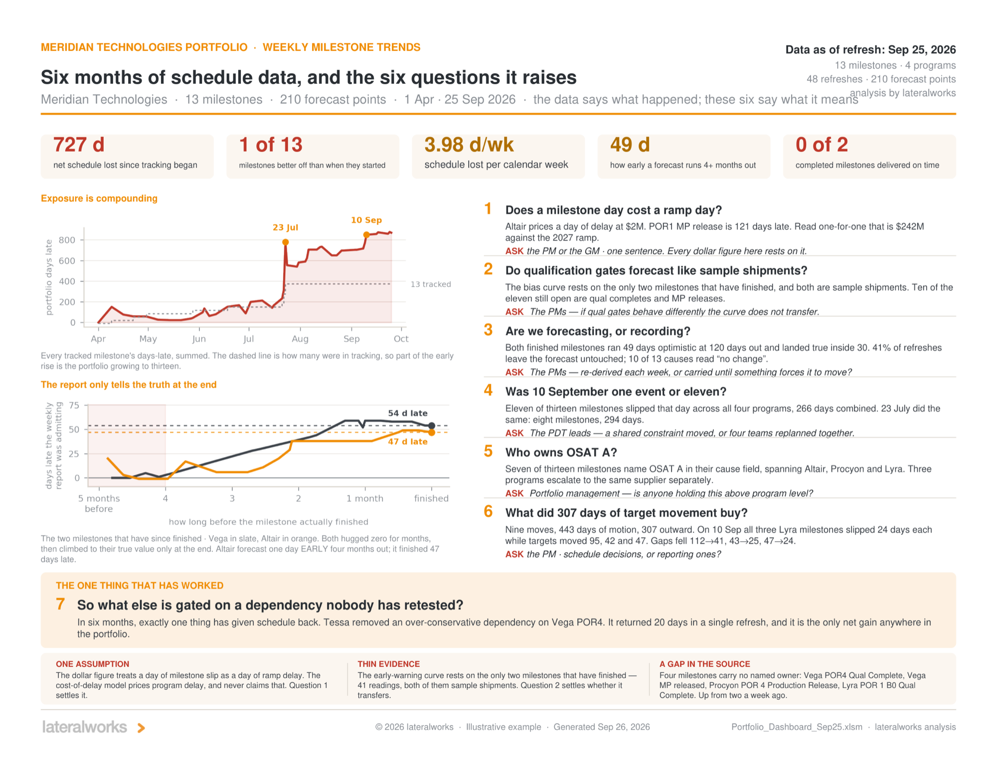
The six-month study reads the whole series and raises six questions for the program, each with the person to ask printed under it. The findings are the kind only a series can surface. The portfolio lost 727 days net since tracking began, 3.98 days per calendar week. Forecasts ran 49 days optimistic when the milestone was still four or more months out and only landed true inside 30 days, which is the planning fallacy wearing a report format: the forecast only converges at the end. Lovallo and Kahneman warned executives about exactly this in 2003. Forty-one percent of refreshes left the forecast untouched, and ten of thirteen causes read "no change." On September 10, eleven of thirteen milestones slipped on the same day, 266 days combined, across all four projects, and the study asks the only question that matters about it: was that one event or eleven? And seven of thirteen milestones name the same supplier in their cause field, across three projects that escalate to it separately. No project report could see that. The portfolio view is the only altitude where a shared constraint is visible.
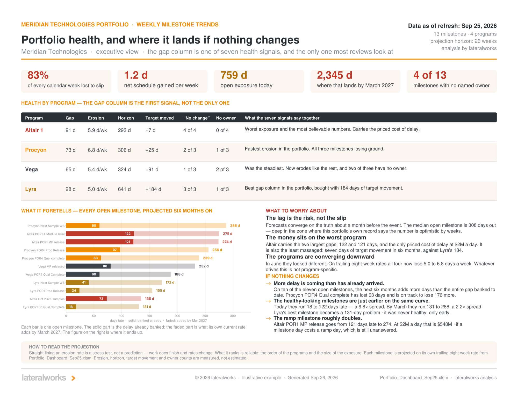
The health-and-outlook study projects every open milestone forward on its own trailing eight-week rate. The method is deliberately blunt, a stress test rather than a forecast, and the page says so. What it ranks is reliable, and what it says is uncomfortable: 759 days of open exposure today lands at 2,345 by March if nothing changes, and the healthy-looking milestones are just earlier on the same curve. Project them forward and the best milestone in the portfolio ends up 131 days late, nine days worse than the worst one today. All four projects erode at 5.0 to 6.8 days per week, which means whatever drives the erosion is not project-specific. That finding redirects the fix from four project recovery plans to one portfolio conversation.
What the instrument is for
The weekly deck runs the review. The studies decide what the review should worry about next. Both come from the same two-file source, the schedule and the workbook, which the teams already maintain because the weekly refresh is how the program plans. The marginal cost of the reporting is zero, and the marginal cost of a new question is one more study on data that is already clean.
In six months of this portfolio’s history, exactly one thing bought schedule back: someone retested an over-conservative dependency and returned 20 days in a single refresh. The study’s seventh question writes itself, and it is the question the whole instrument exists to put in front of leadership: what else is gated on a dependency nobody has retested?
The four documents behind this article are attached below, generalized from a live program. The dashboard is the easy part. The questions it raises are the product.
References: Lovallo and Kahneman, Delusions of Success: How Optimism Undermines Executives’ Decisions, Harvard Business Review, July 2003, and the planning fallacy, both linked above. The companion reporting discipline is Report by exception.
Related reading: The exception report, Aggregate, then Drill Down, The Weekly Schedule Refresh, Seven systemic interrupts, How lateralworks uses AI, The cycle time metric, A fishbone built from the record, and Ten numbers on two clocks.